As all nerds who are obsessed with something know, you start to relate to the characters. I wish I had a super power.
Then you start to become disillusioned with reality. Wait a minute. . . I do have a super power.
I really do, though.
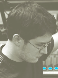
I, Kevin Jeffers, am the master of fonts.
Over the summer, while the Chanticleer was out of print, I worked tirelessly on redesigning the paper. No pay, no official training on the ways of newspaper design (yes, I include the joke of a class that is Publication Design).
Just me, my Mac and a dream -- make the Chanticleer look like a real newspaper and not like a middle school paper like it has in the past.
Or like Nick Nolte's mugshot (props to BHoll for the simile).
After Chris found a way to download the Linotext font for free and I played with other fonts some more, it became obvious.
Less is more.
Two fonts. Times, Helvitica.
Nothing more, nothing less.
Simple, right? You'd think so. But that simple of a notion never occured to previous editors (I base this on the one year I spent around the paper prior to this year). Last year's paper was a parade of fonts.
So there's only one explanation.
Fonts are my super power. I eliminated unnecessary fonts, like a hero.
Save the font, save the paper.
Mission accomplished.
Oh and last night I used Courier New, 14-point font (because it's the biggest font available) to write my research paper. I think cutting corners might be my second super power. . .
To be continued. . .


